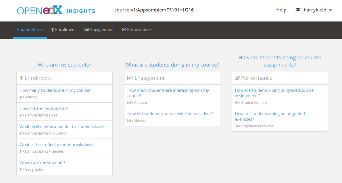
What is edX Insights?
edX Insights is an analytics add-on tool for Open edX that course authors and administrators use to assess learner engagement and performance.
Use edX Insights to gain visibility into:
- The total number of Active Students in a given course
- How many Active Students watched a video in a given course
- How many Active Students tried a problem in a given course
- Geographic location of Active Students in a given course
edX Insights also provides enrollment data, including:
- Daily Student Enrollment Chart (enrollments per day over time)
- Total Enrollment Metric (number of students who have ever enrolled)
- Current Enrollment Metric (net enrollment, or enrollment less any students who have unenrolled)
- Change in Last Metric (current enrollment end of day yesterday versus a week prior)
- Verified Enrollment Metric (current enrollment of students who have elected to pursue a certificate)
- Enrollment Over Time Report (daily count of current enrollments available for review or download. Columns include Date, Current Enrollment for that date, and certificate or enrollment tracks)
The edX Insights Dashboard presents an easy-to-use interface that presents aggregate student demographic, engagement and performance data.
Per-Learner Analytics
edX Insights is a very useful tool that can help course authors and administrators test assumptions about their content and students, and make informed decisions about content, marketing, and more. Appsembler customers have been generally pleased with aggregated trending data.
But if there is one question Appsembler customers ask over and over again, it’s this:
“When will we have access to per-learner data in Open edX?”
Happily, that day has arrived.
On October 7, 2016 edX announced Learner Activity enhancements to edX Insights that Appsembler Open edX customers and others will find very valuable.
With these enhancements, it is now possible to:
- Identify learners who may be struggling, are clearly excelling, and those great “middle”
- Promote interaction in discussions
- Identify learner behavior and activity that may make you wonder as to what’s really going on
At the heart of this new capability are the Learner Roster and Key Activity Report.
The Learner Roster
The Learner Roster provides the following information for each learner per course:
- Problems Tried
- Problems Correct
- Attempts per Problem Correct
- Videos played
- Discussion contributions added
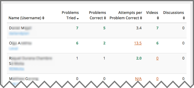
The Learner Roster makes it easy to identify how a learner is performing in any course by any of the previously listed attributes. Metrics are colored coded to make it easy to see who is struggling, excelling, or performing in the great middle as follows, per edX Insights:
- Red, underlined: The learner’s activity is in the 15th percentile or below. These values can indicate learners who might be falling behind or struggling.
- Green, bold: The learner’s activity is in the 85th percentile or above. These values can indicate learners who might be doing particularly well.
- Black: All other values.
In the above example, you can see the standing of each student by each activity. One can readily see that the second learner in the chart, while highly engaged, is struggling to provide correct answers.
Learner metrics are available on a trailing seven-day basis..
The Learner Activity Chart
The Learner Activity Chart provides insight into when your learners have been active by sharing a Daily Activity Timeline of the following:
- Discussion Contributions
- Problems Correct
- Videos Viewed
Course administrators will use the Daily Activity chart to draw conclusions about individual students. For example, the student above is watching a lot of videos, but not answering any problems or adding to any discussions. Determining what this means requires administrators to consider the type of course they are offering, learner demographics, and more.
If this was a fee-based, instructor-led, university course, one might conclude that this learner was in danger of receiving a failing grade. If this was a free, self-paced course, one might conclude that this learner may be keenly interested in the content and has no need to self-test or share insights with anyone. This learner may be perfectly satisfied.
How to know? Instructors can easily ask the learner via the email tool included in the Learner Activity Chart. Instructors can determine if learner needs are being met, if need some additional help, are satisfied, offer encouragement to contribute more in discussions, etc.
Please note that this email feature is NOT the same as the bulk email feature included in the LMS. This outreach will take place via the default email client of the computer being used to access edX Insights. Take care to ensure learners are not communicated with via personal email addresses and that organizational communications standards are maintained.
What’s Going On Here?
edX Insights now makes it easier to assess the behavior and/or motives of a learner by comparing data from the Learner Roster and the Learner Activity Chart. In fact, it makes sense to not read into any data point without looking at the larger picture. edX offers a clear example of this in this “read the docs” article, as well as a much more in depth overview of the capabilities of edX Insights.
For example, a learner who has a high number of corrects and a high number of attempts per correct may initially be thought of as someone who is determined to succeed and very engaged. But looking at the same learner in the Learner Activity Chart may tell a different story. What if the data show that the learner has not watched any of the videos included in the course? This learner is not really engaged, but rather has prior knowledge or is trying to guess her way through the course.